
How Bad Cover Art Can Hurt Your Music Streams Before Anyone Presses Play
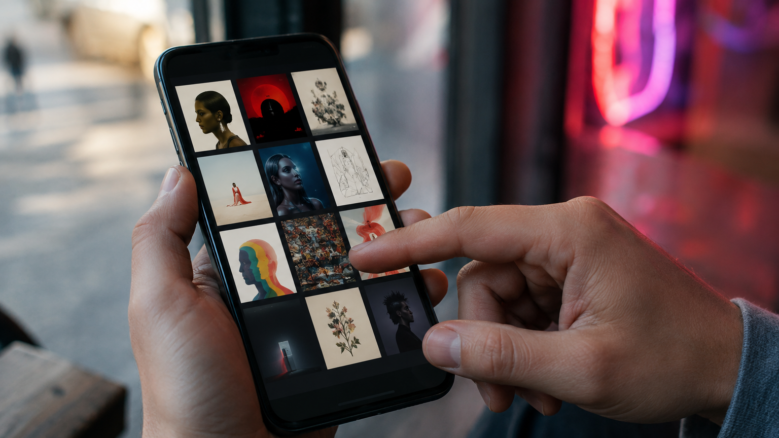
Independent artists will spend weeks adjusting a vocal, replacing a snare and testing masters in three different cars—then approve the cover artwork in one rushed evening. That imbalance can quietly undermine the release before a potential listener hears a single second.
Streaming platforms are audio products presented through visual interfaces. A song appears as a small square inside a crowded feed, playlist, profile, message or social post. In many of those moments, the artwork arrives before the sound. It helps a stranger decide whether the release feels intentional, relevant and worth their attention.
There is no evidence that Spotify directly penalizes a song because its cover looks “bad.” The danger is behavioral. Weak music artwork can reduce curiosity, create the wrong expectation and make promotion less effective. Those lost clicks, shorter listening sessions, missed saves and fewer shares can eventually become fewer streams.
Your Artwork Is Often Heard Before Your Song
A fan who already knows your name may press play regardless of the cover. A new listener has no such reason to trust you. They may discover the track through a playlist, an algorithmic recommendation, a friend’s story, a curator’s inbox or a promotional ad. In each case, your cover is part of the first impression.
That makes album cover art more than decoration. It is packaging for the emotional promise of the music. Before a listener can assess the songwriting or production, the image suggests a genre, mood, level of care and creative world. Strong artwork does not explain everything. It gives the audience enough of the right information to lean closer.
This is especially important for independent musicians without widespread name recognition. If the listener cannot rely on familiarity, every visible detail has to build confidence. An amateur-looking cover can make a professionally recorded song feel less credible, even when the audio itself is excellent.
Bad Artwork Creates the Wrong Expectation
Listeners constantly make predictions. A shadowy portrait may signal introspective R&B. Stark typography can suggest electronic minimalism. A chaotic collage may promise punk energy or experimental rap. None of these approaches is automatically good or bad; the question is whether the visual promise matches the experience delivered by the song.
When the cover and the music tell different stories, the wrong audience may click while the right audience scrolls past. A delicate acoustic song presented like an aggressive club record creates confusion. A futuristic hyperpop track wrapped in generic stock photography may look interchangeable with hundreds of unrelated releases.
The cost is not simply aesthetic. A mismatch can make the first seconds of the track feel disappointing because the artwork framed the listener’s expectations incorrectly. Good design prepares the mind for the sound. Bad design can force the song to overcome an unnecessary contradiction.
The Problem Gets Worse at Thumbnail Size
Many covers are designed large on a laptop, where every texture and line of type is visible. That is rarely how people first encounter them. On a phone, the artwork may appear smaller than a postage stamp beside other releases competing for the same glance.
At that size, weak visual hierarchy becomes obvious. Tiny text disappears. Similar colors collapse into a muddy block. Multiple subjects compete instead of creating a focal point. An image that looked detailed at full size can become unreadable inside a playlist.
Run a simple thumbnail test before approving your artwork: shrink it until it is approximately the size it would appear in a mobile music app, place it among eight other covers and look away for a few seconds. When you return, can you identify it immediately? Does it still communicate the correct mood? If not, the design needs another pass.
Visuals Influence What Happens After the First Stream
The value of visual identity does not end when playback begins. Spotify’s Fan Study on artist connection reports that, when the Now Playing view is open, tracks with a Canvas are saved or added to playlists more than four times as often on average as tracks without one. Spotify also reports that adding or refreshing a Canvas increased off-platform shares by more than 10 percent.
Canvas is a looping visual rather than a static cover, so those figures do not prove that replacing one album image will multiply streams by the same amount. They do show something useful: listeners respond to the complete presentation of a song. Visual engagement can support the actions—saving, playlisting and sharing—that extend a release beyond one passive play.
Spotify also says that after a listener playlists an artist, that listener streams the artist 41 percent more on average and is 12 percent more likely to visit the artist’s profile. The path from artwork to growth is therefore indirect but meaningful: a stronger presentation can make engagement more likely, and engagement can create repeat listening.
Research Suggests Cover Design Can Affect Listening Time
A 2024 study published in Psychology & Marketing examined how line orientation in album artwork related to market performance and music consumption. Across archival data and experiments, artwork with stronger horizontal and vertical structure was associated with greater aesthetic appeal, better chart performance and longer listening than artwork dominated by oblique lines.
The study isolates one specific design feature, not a universal formula for successful covers. It cannot tell every artist to use the same grid or prove that an “ugly” image automatically causes low streams. Its more important implication is that visual properties can influence how listeners perceive and consume the music attached to them.
In other words, audiences do not always keep sight and sound in separate mental boxes. The pleasure or discomfort created by the artwork may spill into their judgment of the song itself.

What Actually Makes Music Artwork Feel “Bad”?
Bad cover art is not the same as strange, low-budget or unconventional art. Some of music’s most memorable covers are deliberately raw. The problem is usually a lack of intention.
No clear hierarchy. The eye has nowhere to land because every element demands equal attention.
A mismatch with the music. The visual language attracts the wrong listener or misrepresents the song’s emotional tone.
Illegible typography. Decorative fonts, weak contrast and excessive wording become noise at mobile size.
Poor technical execution. Accidental blur, rough cutouts, distorted images and awkward cropping communicate unfinished work.
Generic visual identity. Stock imagery or predictable AI aesthetics may look polished but fail to make the artist recognizable.
No continuity. Each single appears to come from a different artist, making it harder for fans to recognize a release series.
Apple Music’s official cover art guidance similarly warns against misleading or generic imagery, irrelevant text, unintended blur, pixelation and poor cropping. These are distribution standards, but they are also useful creative checks.
Bad Artwork Can Weaken the Entire Promotion Campaign
A cover has to work far beyond the streaming service. It may become the center of a pre-save page, press release, playlist pitch, music blog feature, short-form video, story post, email banner and paid advertisement. If the core visual is confusing, every promotional asset inherits the problem.
For curators and journalists, presentation also affects efficiency. They may review hundreds of submissions. Strong artwork cannot buy coverage, but a coherent release package makes the music easier to understand and position. If you are preparing a campaign, Uranium Waves’ Music Release Planner can help you map those assets and deadlines before release day rather than improvising them afterward.
The same logic applies to paid traffic. An ad can be targeted perfectly and still lose attention because the creative does not communicate quickly. Artists who need a clearer campaign direction can use Uranium Waves’ music marketing consulting to connect the visual identity, audience and release strategy.
How to Fix Your Cover Before Release Day
Define the promise in one sentence. Describe what the listener should feel before playback. Use that sentence to judge every design decision.
Build for the smallest screen. Check the artwork on a phone and at true thumbnail size, not only on a large monitor.
Study the competitive shelf. Place your cover beside current releases in your genre. Look for visual conventions you can understand without copying them.
Create one strong focal point. Decide what should be noticed first, second and third. Remove anything that weakens that order.
Test without explaining. Show the image to three people who understand the target audience. Ask what kind of music they expect and what emotion they feel.
Build a flexible system. Prepare square artwork, social crops, a clean background, type treatments and short-form visual elements as one family.
Check the technical delivery. Follow your distributor’s current specifications and inspect the final export for blur, color shifts and accidental cropping.
Do this early enough to revise. Your electronic press kit, social rollout and pitching materials will all become stronger when they grow from the same visual system.
Strong Artwork Cannot Rescue a Weak Song
Visual strategy should never become an excuse to neglect the record. A striking cover may win the first click, but it cannot manufacture replay value. Listeners still need a compelling song, an appropriate master and a reason to return.
The opposite is also true: excellent music should not be forced to succeed despite weak packaging. Before delivery, use a technical tool such as the Uranium Waves Master Loudness Checker, then give the artwork the same final-round attention you give the audio. Sound and presentation have different jobs, but both influence whether a release gets a fair chance.
Final Takeaway
Bad cover art does not press a hidden “reduce streams” button inside Spotify or Apple Music. Its impact is subtler. It can lower curiosity before playback, set the wrong expectation, disappear at thumbnail size and make every promotional placement less effective.
Strong music artwork creates recognition and emotional alignment. It tells the right listener that the release belongs in their world, then gives them a visual memory to attach to the sound. For an independent artist fighting for attention, that is not a cosmetic detail. It is part of the listening experience—and part of the release strategy.
Enjoyed the read? Consider showing your support by leaving a tip for the writer
Featured Music








Sponsored


ALBI. designs “HEARTBEAT” around propulsion. The Brisbane/Meanjin artist layers syncopated synths, distorted bass, and punchy drums into an alt-pop structure that feels engineered for movement, while her crunchy, soaring vocal adds a roughened edge to the song’s otherwise polished momentum. Produced by Song Higginson, the track…